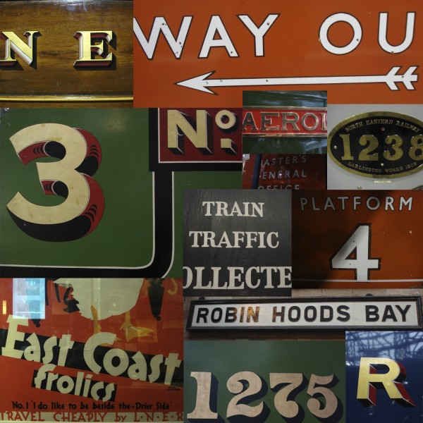
montage of photos taken at the national railway museum researching typography that would have been seen on locos and carriages travelling on the line and posters advertising holidays by train on the east coast of yorkshire. the LNER who owned the line prior to nationalisation had, by far, the most integrated corporate image of all the railway companies and commissioned some stunning artwork, notably by tom purvis and frank newbould. they remain the iconic railway posters of that, or any other, era. interestingly, with the exception of special trains such as the all silver streamlined ‘Silver Jubilee’ service, the LNERs rolling stock had a much more traditional appearance with its varnished teak carriages. typography on our artwork is influenced by the LNER (and later British Railway’s) house font Gill Sans, the contrast with victorian ‘fat face’ and ‘egyptian’ fonts as seen on carriages and timetables and the typographic playfulness of the LNERs posters
© 2009 admin

